The accessibility gaps I found in 26 competitors became the rules
Problem
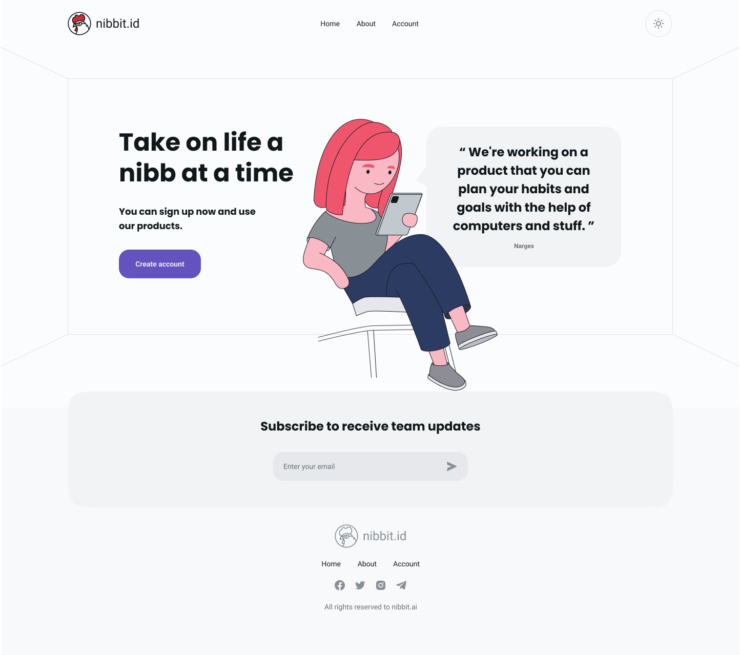
People rarely fail at habits because they picked the wrong one. They fail around week two, when the novelty goes and nothing replaces it. Interviews and a survey kept returning the same two complaints: motivation runs out, and quitting a bad habit gets no help, because nearly every app is built to add. Habbit answered both, building and quitting feeding one system of streaks, levels and trophies, with an AI companion called Pebble to talk to about the progress. The launch site had to carry that promise before any of it existed, and its first concept did not.
Research
Habbit was three products wearing one name, a habit tracker, a game, and a conversation with an AI, so the audit covered all three markets rather than the one on the label. Interviews, a survey, personas and journey maps ran alongside it, and usability testing followed on the screens that came out. The habit trackers were the least surprising and the most useful: not one of them was built around the week-two problem.
| Market | Audited | What it was there to answer |
|---|---|---|
| Habit trackers | 6 | The direct comparison, pricing, streaks, and where each one loses people |
| Gaming | 7 | How returning is made to feel like a reward rather than a duty |
| AI chat | 13 | How a companion talks without pretending to be a person |
Accessibility
Accessibility was one of the sixteen columns, so all twenty-six products were read for it, and the same failures kept coming back. Those complaints became the rules, for the app and the site alike. The site was then tabbed end to end: keyboard only, no screen reader, and I will not claim otherwise. The palette was measured rather than assumed, the mark carries 16.3:1 on its outline, so the colour is decoration and the black line is doing the work.
| Found in a competitor | Rule it became |
|---|---|
| Titles built as text tags, not headings, in both leading habit trackers | Structure written as structure, so assistive tech gets a real outline |
| No features for audio or visual impairment, and English only | Short plain copy, and a layout built to take a second language |
| A text field under half the standard size | Controls sized to be hit rather than aimed at |
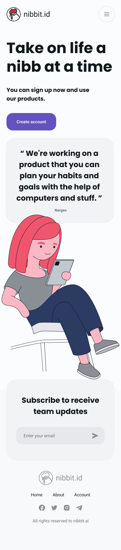
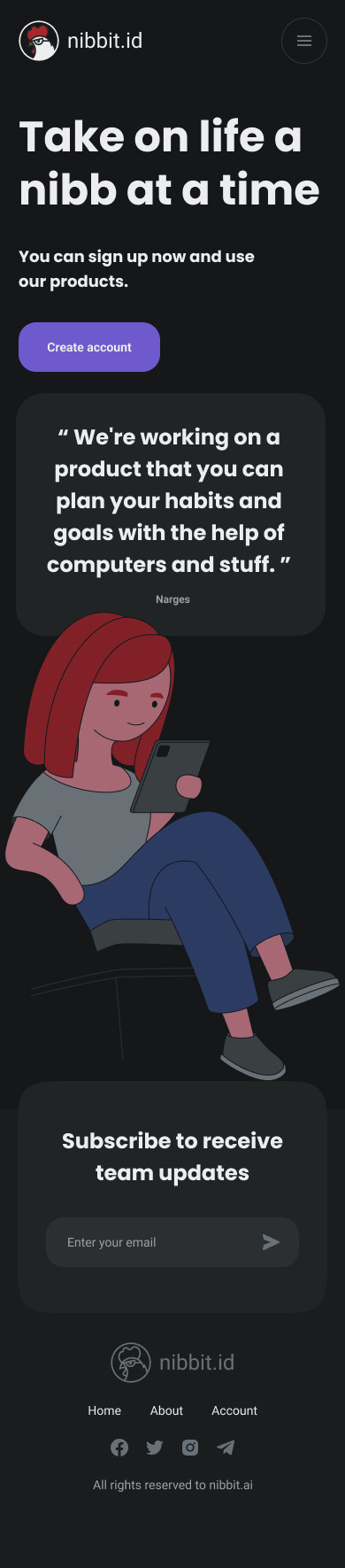
| Dark theme only, noted as making some people uncomfortable | Two themes, drawn separately rather than one inverted |
System
The design system reached v2.1 before the MVP shipped, and its cover states the goal in the team's own words: an accessible system with meaningful elements. What makes it usable is that it is drawn for the states nobody enjoys drawing, checkboxes in five, radios in four, every indicator in both light and dark. That last one is why two themes were a build decision rather than a retrofit. Type is split by job, after six candidates were set in one specimen line and compared: Poppins carries the headings, Roboto everything you actually read.
| Style | Face | Size / line height |
|---|---|---|
| H1 | Poppins Bold | 60 / 72 |
| H3 | Poppins Bold | 48 / 60 |
| H5 | Poppins Bold | 24 / 36 |
| Body large | Roboto Regular | 16 / 24 |
| Body | Roboto Regular | 14 / 20 |
| Caption | Roboto Regular | 12 / 18 |
Product
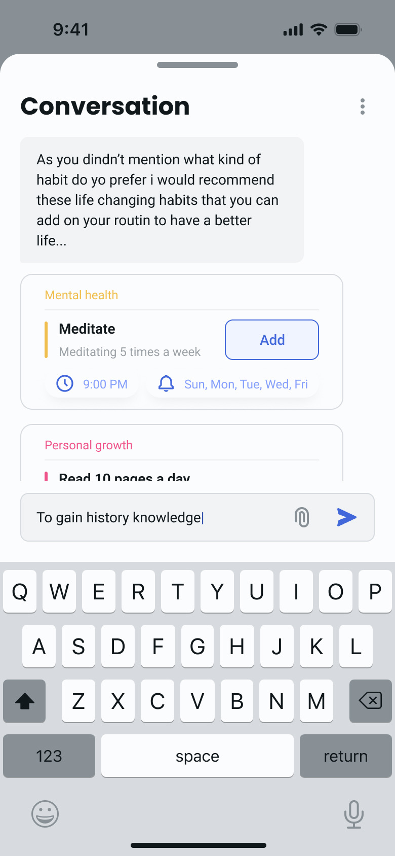
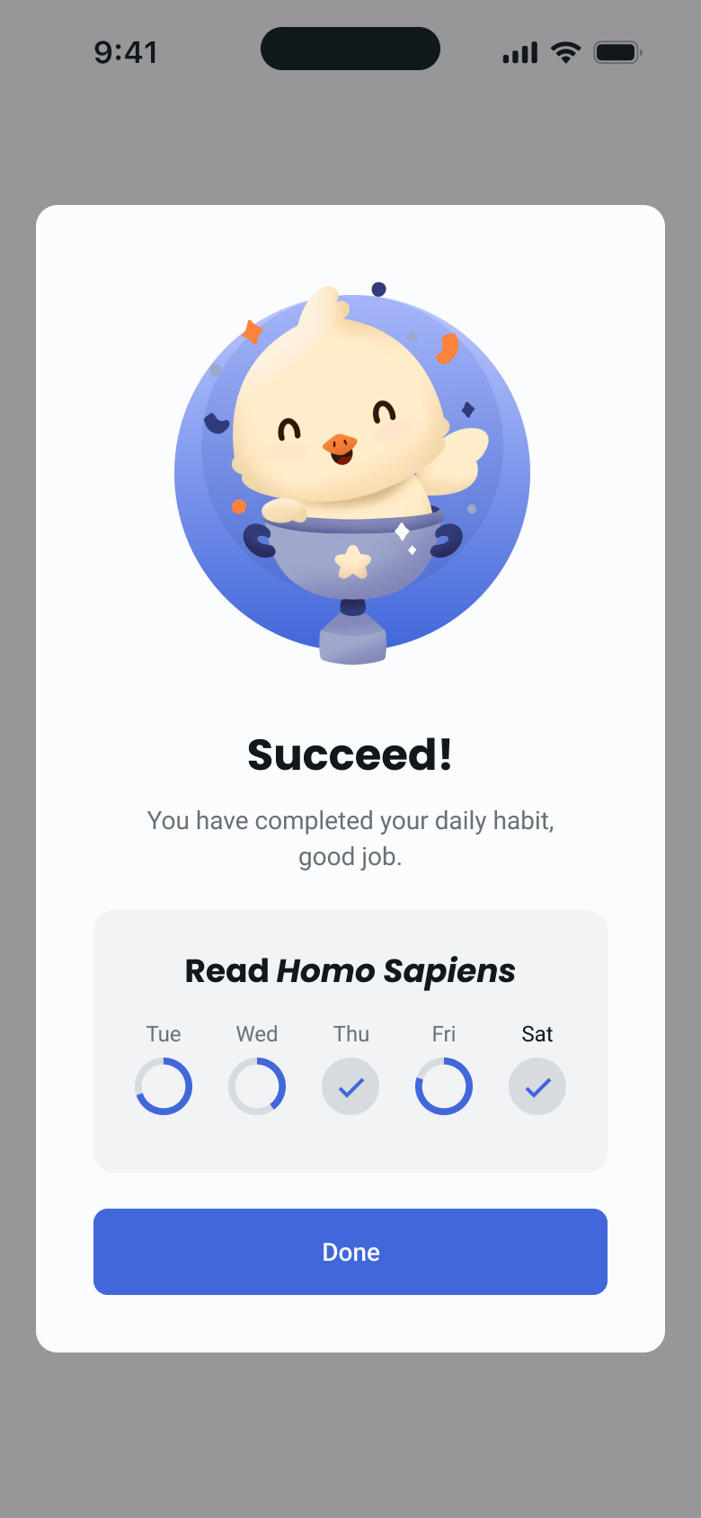
Two screens carry the argument. Pebble opens by admitting what it does not know, then offers habits as cards you add with one tap. Each card already carries its category, time and days, so agreeing to a habit and scheduling it are the same action. The success screen is where the gamification and the accessibility meet: completed days are marked with a tick as well as a filled ring, so the state is never carried by colour alone.
Outcome
Both halves shipped as designs: the research, the system, the app screens, and the launch site and brand around them. Not all of it was finished, the commitments section went into the final About page still carrying a bullet that reads "Community:" with nothing after the colon. And the site itself is gone; nibbit.ai today serves a seven-line poem. The work stands on its judgement rather than its traffic, which is the honest claim for a product that never reached the people it was researched for.
26
competitors audited, three markets
10,30
people interviewed and surveyed
5
states drawn per checkbox