An accessibility audit that changed the product, not just the markup
Problem
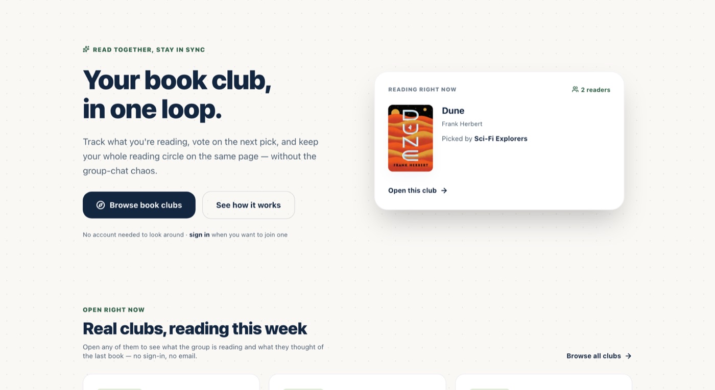
BookLoop is a book club app where progress, posts and votes update live. It had two accessibility problems and only one of them was visible. The first was ordinary and severe: 73 of its 110 form controls had no accessible name, because labels were written as siblings of their inputs rather than linked to them, including the Email and Password fields on the sign-in screen, the first thing anyone touches. The second was that the product assumed an uninterrupted reader. You read fifteen pages on a Tuesday, nothing for nine days, then an hour on a plane, and by the time you finish, the thing you wanted to say about chapter three is gone. That gap hits everyone, and it hits people with ADHD, brain fog or fluctuating capacity considerably harder.
- before
edit, blank
- now
Email, edit, blank
Process
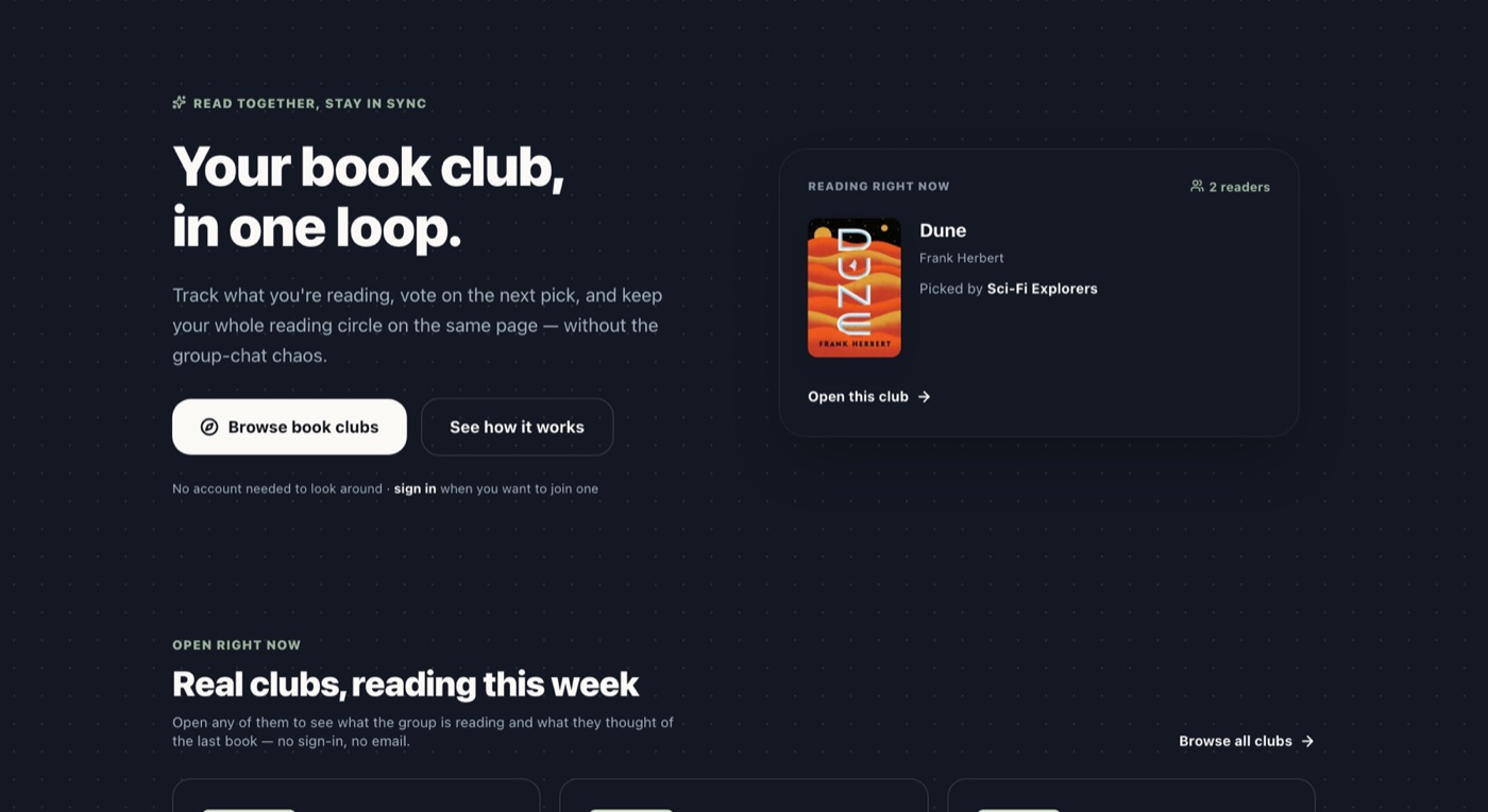
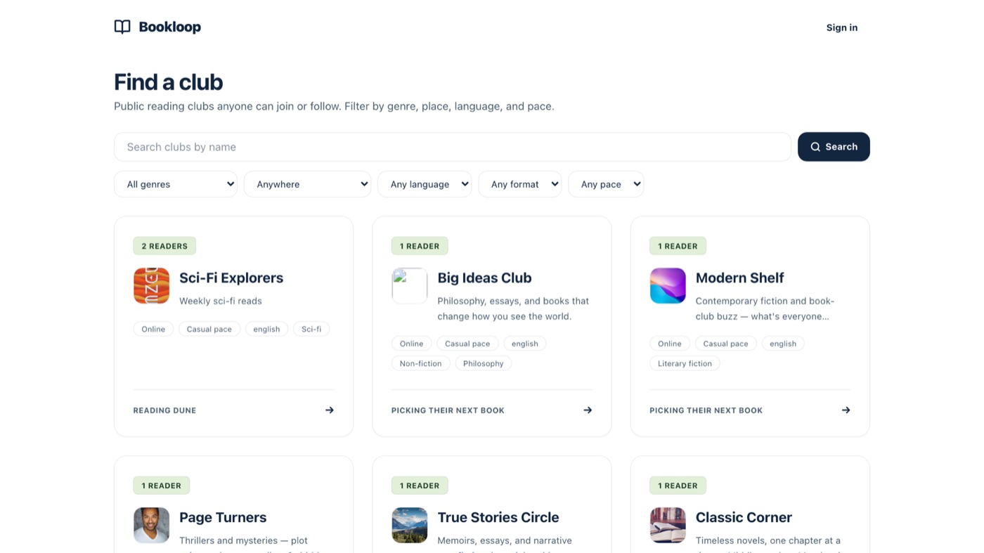
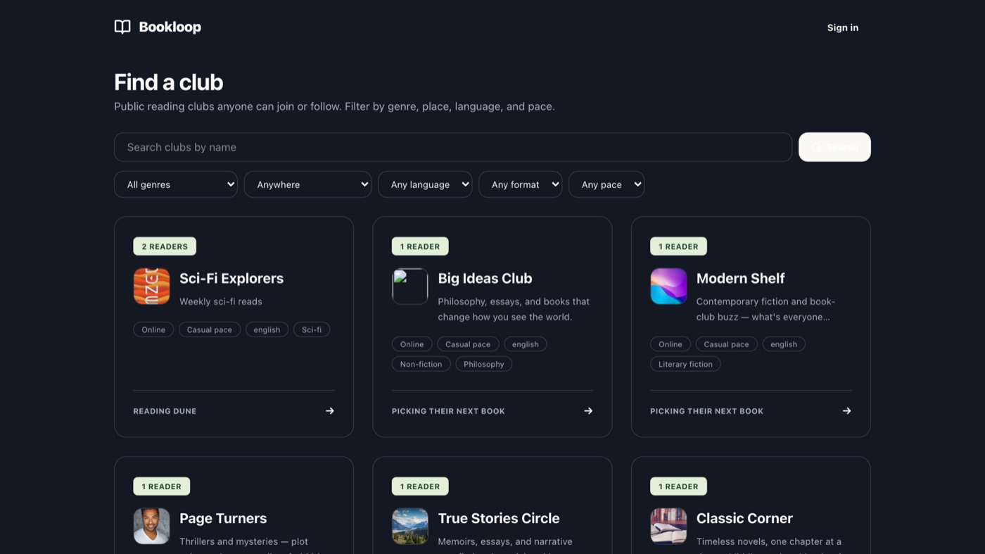
Two passes, because the two kinds of defect hide from different tools. A static scan of every component file checked each control for an accessible name and each label for a real association, that is where the 73 came from, and the 30 labels attached to nothing at all. Then I ran the app locally against its own database and measured contrast on the rendered elements in both themes rather than reading it off the palette. That is how the dark-mode Search button turned up at 1.05:1, white on cream, from a hardcoded text-white sitting next to a background token that flips from navy to cream between themes, a pairing that appeared 98 times. Both counts come from short scripts that re-run against the repo, so every figure on this page can be checked rather than taken on trust. The remaining four defects were found by using the product, not by scanning it.
System
The design system is real: semantic colour tokens, a full second set for dark, and shared Card, Avatar and Button primitives. It failed in two ways at once. Nine of its tokens were declared only inside the dark block and never in the theme block, so the build emitted no utility class for them, including the near-black foreground that would give 8.7:1 where white gave 2.2:1. Those nine existed, they were correct, and no markup could reach them; every hover state written against them silently did nothing, in both themes. The other failure is adoption. A shared Button component was added specifically so this class of bug could be fixed in one place, and its own comment says so. Nothing ever imported it. Two decisions went the other way, and neither was filed as accessibility work: the type is the system font stack, so OS text settings apply without a webfont overriding them; and the datetime pickers are the native ones, kept rather than rebuilt, which preserves the platform behaviour nobody reimplements correctly, native clear included. Small calls, both, and each one is a decision not to reinvent something the platform already does accessibly.


| Primitive | At audit | Now |
|---|---|---|
| Card | 26 files importing it | Unchanged, working as intended |
| Button | 0 files, dead code, every button hand-styled | 48 files, 112 buttons, one place to fix contrast |
| Hand-styled buttons | 78 elements, 55 class signatures | 156 remain by design: tabs, chips, icon buttons, toggles |
Outcome
Every finding is fixed, four during the audit, ten more in the remediation pass that followed, and the whole of it shipped as v0.18.0, verified from the outside by reading the Button primitive's class signature off the live Search button, because a green deploy job is a claim and the served page is a fact. Two of the fourteen were never in the original audit at all: the recap cards and the broken club cover surfaced later, the cover only because someone looked closely at a screenshot on this very page. A list that grows after you stop looking is why the pass ended with a gate rather than a celebration: the audit's scan scripts became a CI test with a 99-finding baseline, the baseline was ratcheted to zero, and a regression now fails a build instead of waiting for a person to notice. Two fixes are worth telling in full. The first looked like a keyboard bug and was corrupting data: half-star ratings were chosen by cursor position, and keyboard activation reports a cursor position of zero, so keyboard users could set 2.5 stars but never 3. Club ballots are decided by average stars, so keyboard votes ran half a star low and could change which book a club read. The fix changed the design rather than the markup, five focusable stars became one slider with the stars decorative, arrows previewing and Enter committing so a trip from 1 to 5 does not fire five writes at everyone watching the ballot. The second is the one the audit filed as a decision rather than a patch: the live app that never spoke. Announcing everything would have been worse than announcing nothing, a polite live region queues rather than drops, so a club with eight active members would put a screen reader minutes behind the screen. Instead every streamed event is classified one of three ways: the rare and consequential speak on arrival, a ballot closing with the winning title, a meeting being scheduled; real content batches, coalescing over a ten-second window into one line, five new posts and a member joined; and ambient telemetry stays silent, presence, typing, ticking tallies, because the screen already carries it. The rest closed the way a list should: a name on every control including the 31 that had only a placeholder, legible dark-mode fills, self-hosted covers that fall back when a load fails, a text alternative on the recap cards, Escape and a focus trap on the last dialog, a skip link, reduced motion honoured across the app, and nine dead tokens finally compiling. The plan shipped too: the Button primitive went from zero importers to 48 files, 112 buttons in one pass, and adopting it caught two ways the unused abstraction had rotted, no focus-visible ring and invisible to the CI scanner, while the audit's own count of 78 hand-styled elements turned out to be an undercount, the migration found 280. And the review composer now shows your own notes on the book in reading order, each one tap from becoming the draft. Recall became recognition, as proposed.
Open
Nothing from the audit is open, and nothing from the plan is either, the section above ate both. Two things are still true, and this section exists to say them. Three buttons have no home in the primitive: an amber flag-for-review and two outline-danger actions that no variant fits, exceptions on purpose until a warning variant earns its place. And the merged-but-unreleased gap is structural rather than solved: four minutes after the v0.18.0 tag, the next feature had already merged onto main, real again, and live on nobody's phone again. A release closes the gap; only cadence keeps it closed.
| Remaining | Detail | Kind |
|---|---|---|
| Three buttons without a variant | An amber flag-for-review and two outline-danger actions; a warning variant would home them | Structural debt |
| The release gap re-opens | Four minutes after the v0.18.0 tag, the next merge was once more live on nobody's phone | Cadence |
Next
Short, which is what a plan should be after it has mostly happened.
| When | Do | Why this order |
|---|---|---|
| This week | Home the three exception buttons, or bless them | A warning variant, or a comment saying why not, either ends the ambiguity |
| Ongoing | Keep releases boring and frequent | The merged-but-unreleased gap re-opens with every merge; cadence is the only fix that stays fixed |
Strategy
The design-system lesson here is not "write a design system", BookLoop did. It is that an unadopted primitive is worse than none: it created the belief that contrast was centralised while the truth was 55 hand-written variants, and while it sat unused it rotted, no focus ring, invisible to the scanner, so adoption had to begin by fixing the abstraction it was adopting. The other lesson is the one I would defend hardest: cognitive accessibility is product strategy, not an accommodation bolted on afterwards. The product is built for someone who forgets the book, and the mechanisms below are shipped rather than proposed, which matters, because this is the argument people assume is aspirational. Every one of them is a reason someone is still in the club in week six. The last lesson is quieter: the fastest way to keep a fixed thing fixed was to let the audit's own scripts keep running, the same counts that opened this page now fail a build when they move.
| Decision | What it does | Who it protects |
|---|---|---|
| Progress is a percent, not a page | The only unit that means the same thing to a paperback, an ebook and a fourteen-hour audiobook | Audiobook readers, whom a page count renders as nothing at all |
| Notes carry an anchor | A note holds the place you had the thought, and anything anchored past your position stays sealed until you reach it | Anyone opening a three-week-old thread who does not want it spoiled |
| Sealing fails closed | When two anchors cannot be compared, the note stays hidden rather than leaking. Finishing the book unseals everything | Everyone, a spoiler shown once cannot be taken back |
| Yesterday still holds the streak | Reading days bucket in UTC, and yesterday sustains the streak until today ends | Bursty readers, whom a strict streak punishes for the pattern they already have |
| A behind-pace clubmate gets a poke | Anyone in the club can nudge whoever has fallen behind the pace goal, from the club page or the book page, and the confirmation is spoken as well as shown | The week-six lapser, whom silence would lose for good |
| Two taps to log progress | Page logging sits on the home screen instead of behind the book | Anyone for whom the logging tax is the first thing they stop paying |
| Capture without opening the app | A bearer-token endpoint takes notes from Siri, Shortcuts or a Kobo | Motor impairments, and anyone whose thought arrives mid-chapter |
| Abandoned setup resumes | A resume link and a recovery email pick the wizard up where it stopped | Interrupted attention, the case setup would otherwise lose outright |
73/110
controls with no accessible name, at audit
1.05:1
the dark-mode Search button, at audit
99 → 0
the CI baseline, shipped live in v0.18.0